
WeBike
UX/UI Design
WeBike is an integrated app for cyclists to find local shops, people, and clubs to connect within their communities. The demographic includes casual cyclist, athletes, and more!
In this project my personal role was conducting interviews, creating empathy maps, and building the overall experience of the mobile application to understand the users I’m designing for and their needs as cyclists.
Project Overview
The Product:
WeBike is an integrated app for cyclists to find local shops, people, and clubs to connect within their communities. The demographic includes casual cyclist, athletes, and more.
Project Duration:
6 Months
The Problem:
Finding local riders, bike shops, places to repair bikes, and new riding routes can be difficult and time consuming.
The Goal:
Create an app with a sense of community, with an all in one approach to avoid developing paint points by using multiple apps and resources.
User Research
Defining
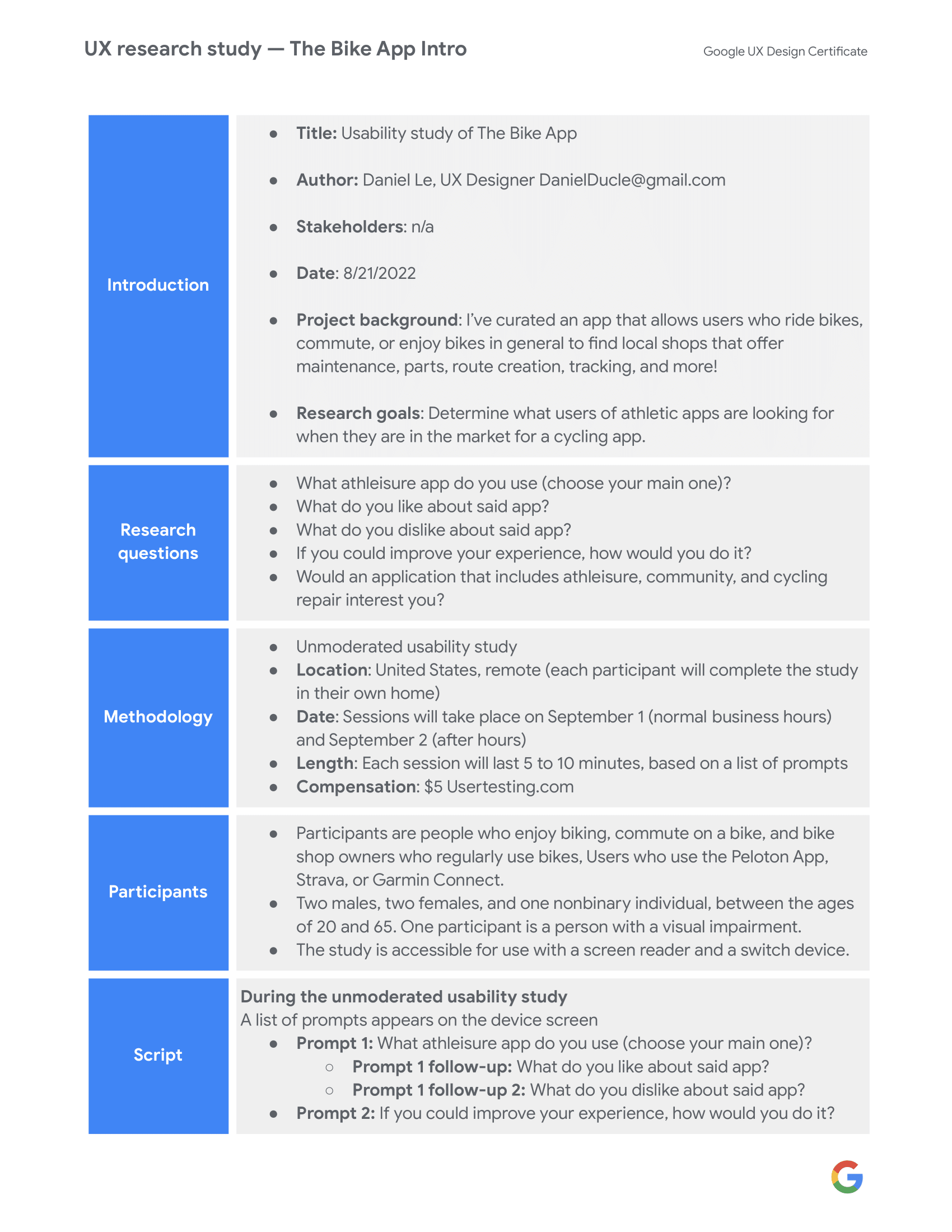
Pain Points
1.
Finding reputable bike shops for maintenance and parts can be hard.
2.
Routes that cater to bicycles are normally generalized and can be dangerous if it’s not meant for bicyclist specifically.3.
Apps that cater to bicyclists tend to be just for creating routes and tracking calories but doesn’t offer the maintenance aspect of owning a bicycle.4.
Not many apps that allow you to message bike experts in your area on specific questions you have on your mode of transportation.
Persona:
Sam & Josh
Problem statement:
Sam & Josh are two users
who need assistance on bike maintenance and finding routes specifically for bicycles
because there is not many apps that cover both.

Product Mapping Tool

Storyboards
(A sketch of what the scenario would be to complete the goal of scheduling your first maintenance session.)

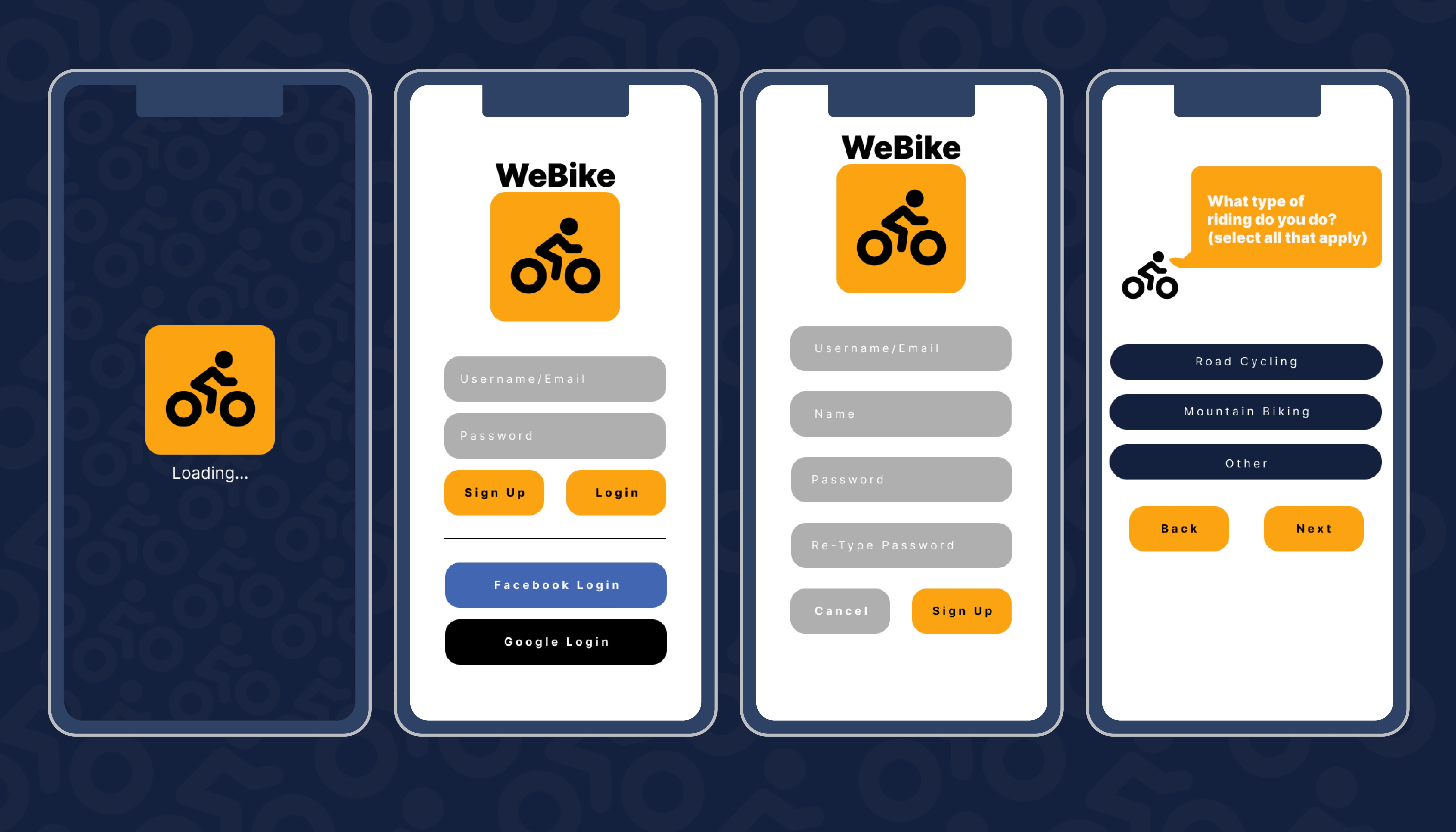
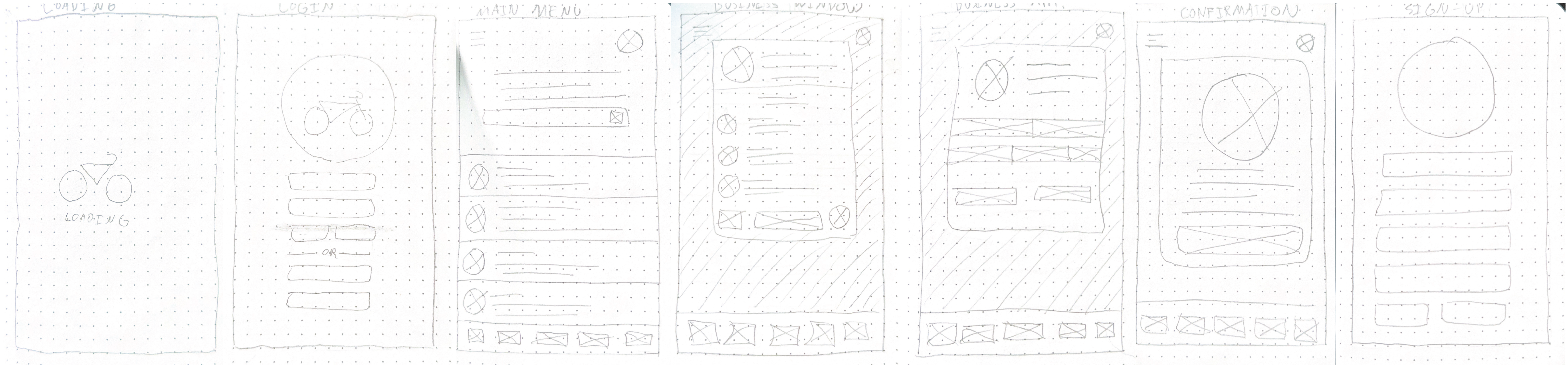
Paper Wireframes
(A few of the initial Paper wireframes of the process needed to set up your first appointment.)
Low-fidelity Prototype

User Journey Map
Creating the user journey map for WeBike revealed how ease of use, and availability created low accessibility issues.

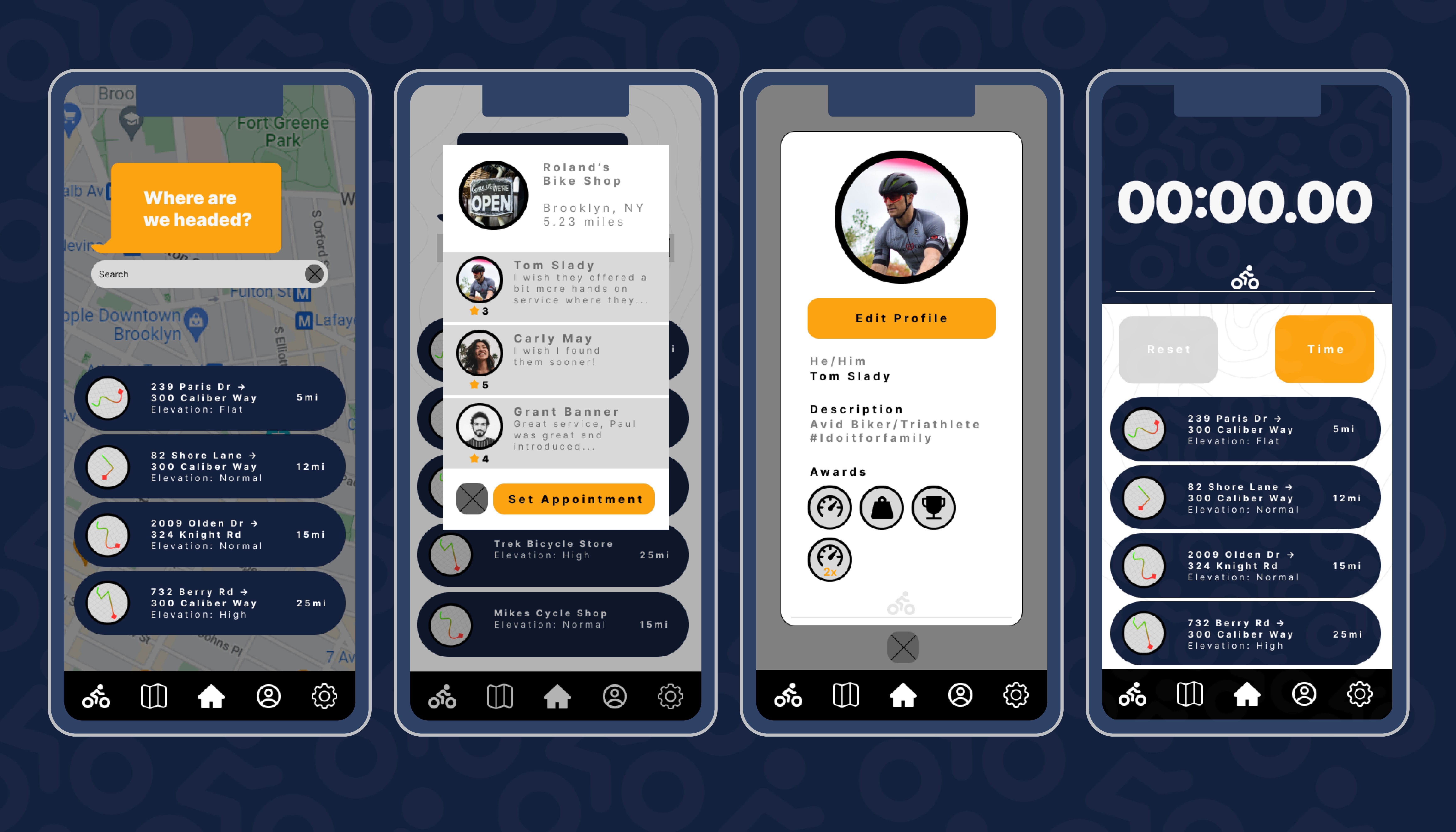
Digital Wireframes
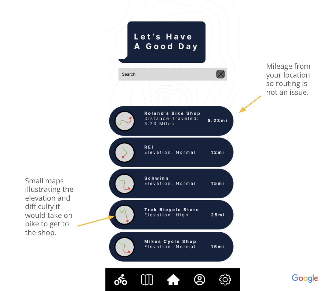
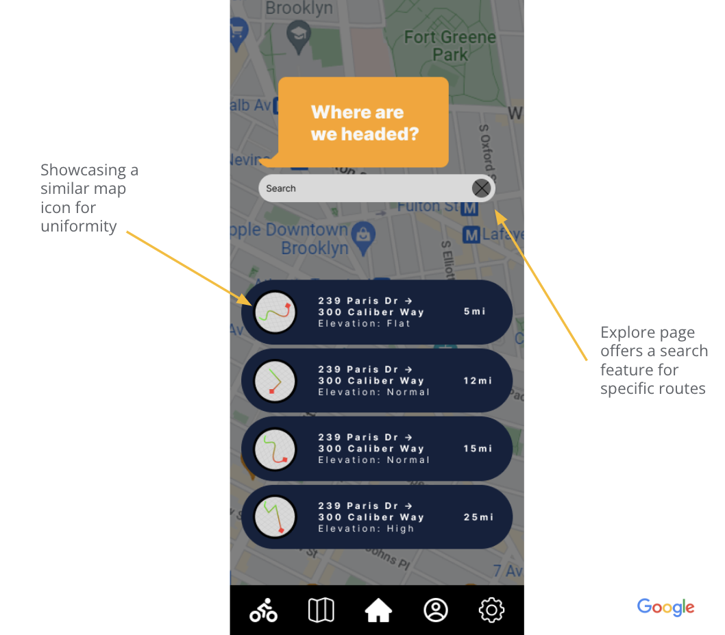
The general design of WeBikes pages were to create a sense of what you would need to travel to a certain location with your bike, so having set icons, mileage as a straightforward approach helps cyclists navigate quickly before a trip.
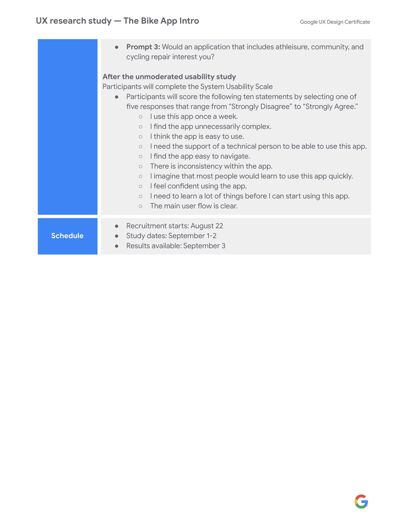
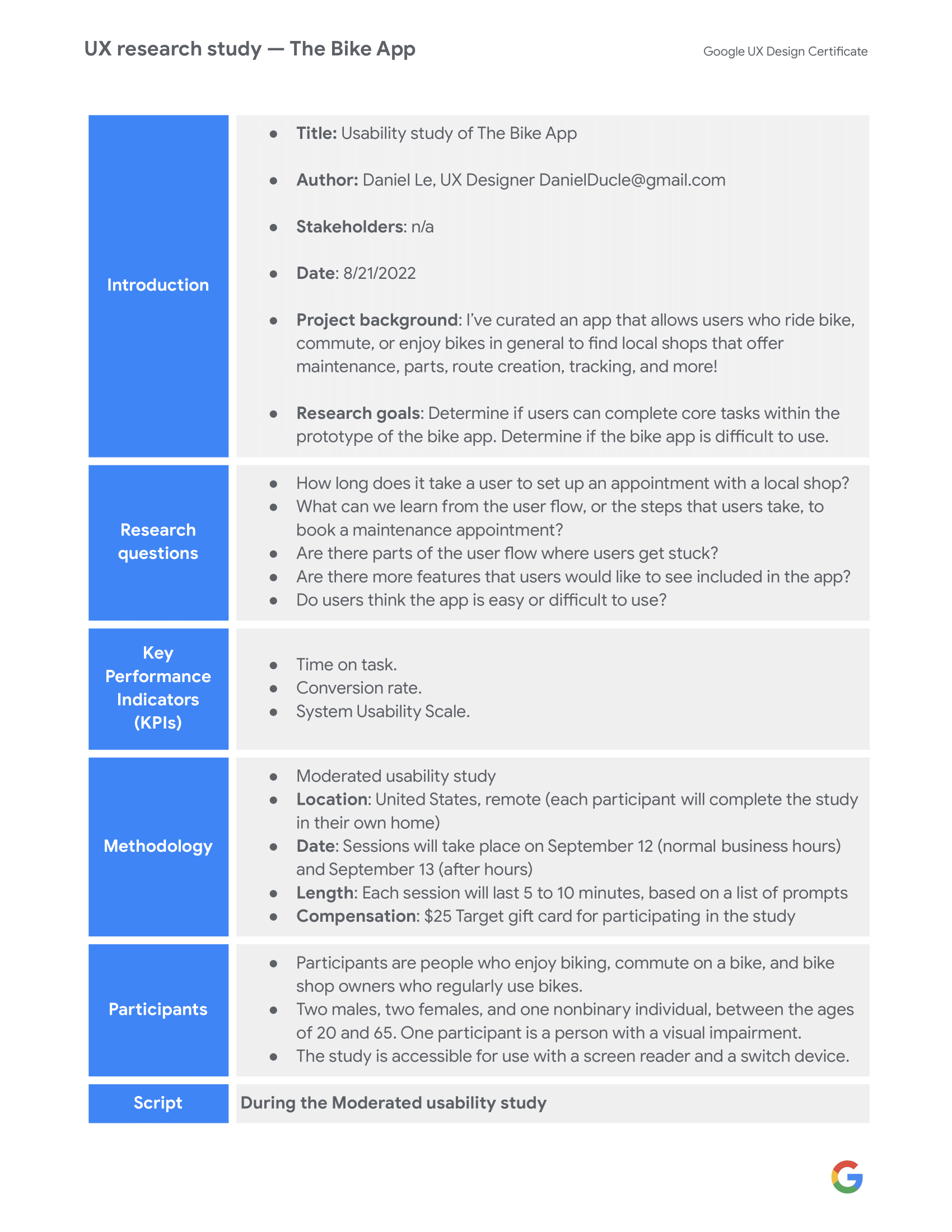
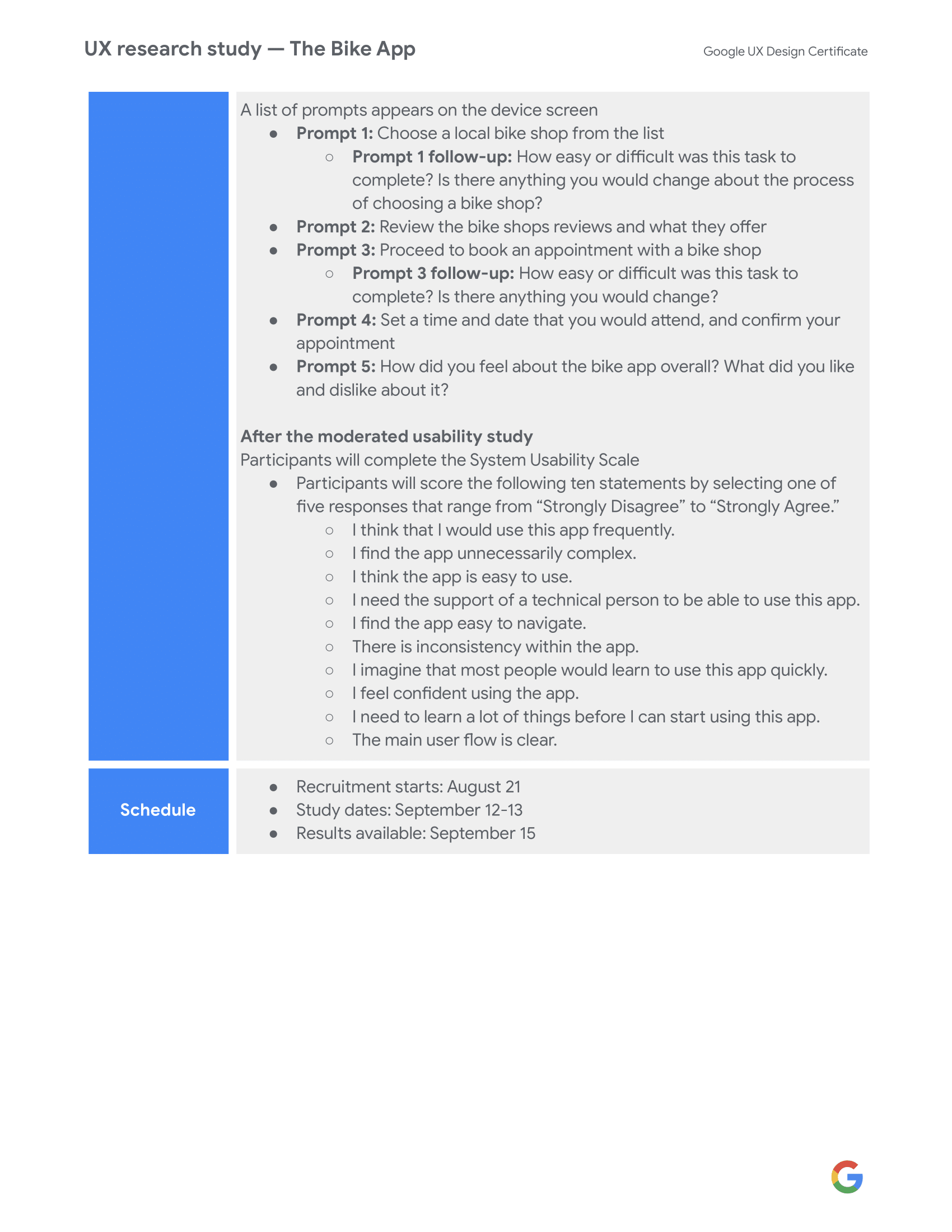
Usability Study
Findings
After conducting two rounds of usability studies. Findings from the first study helped fill in the gaps from the initial sourced design. The second study used a high-fidelity prototype and revealed small complications the low-fidelity couldn’t solve.
Round 1 Findings
1. Instant UI at a glance before bike rides causes less pain points for the user.
2. Badge System would create an overall more rewarding experience
3. Knowing the price before service initiates retention
1. Instant UI at a glance before bike rides causes less pain points for the user.
2. Badge System would create an overall more rewarding experience
3. Knowing the price before service initiates retention
Round 2 Findings
1. Icons to have distinct universal language
2. Buttons need to be obvious colors that stand out from background
3. Routes need to be by distance instead of most rated
1. Icons to have distinct universal language
2. Buttons need to be obvious colors that stand out from background
3. Routes need to be by distance instead of most rated


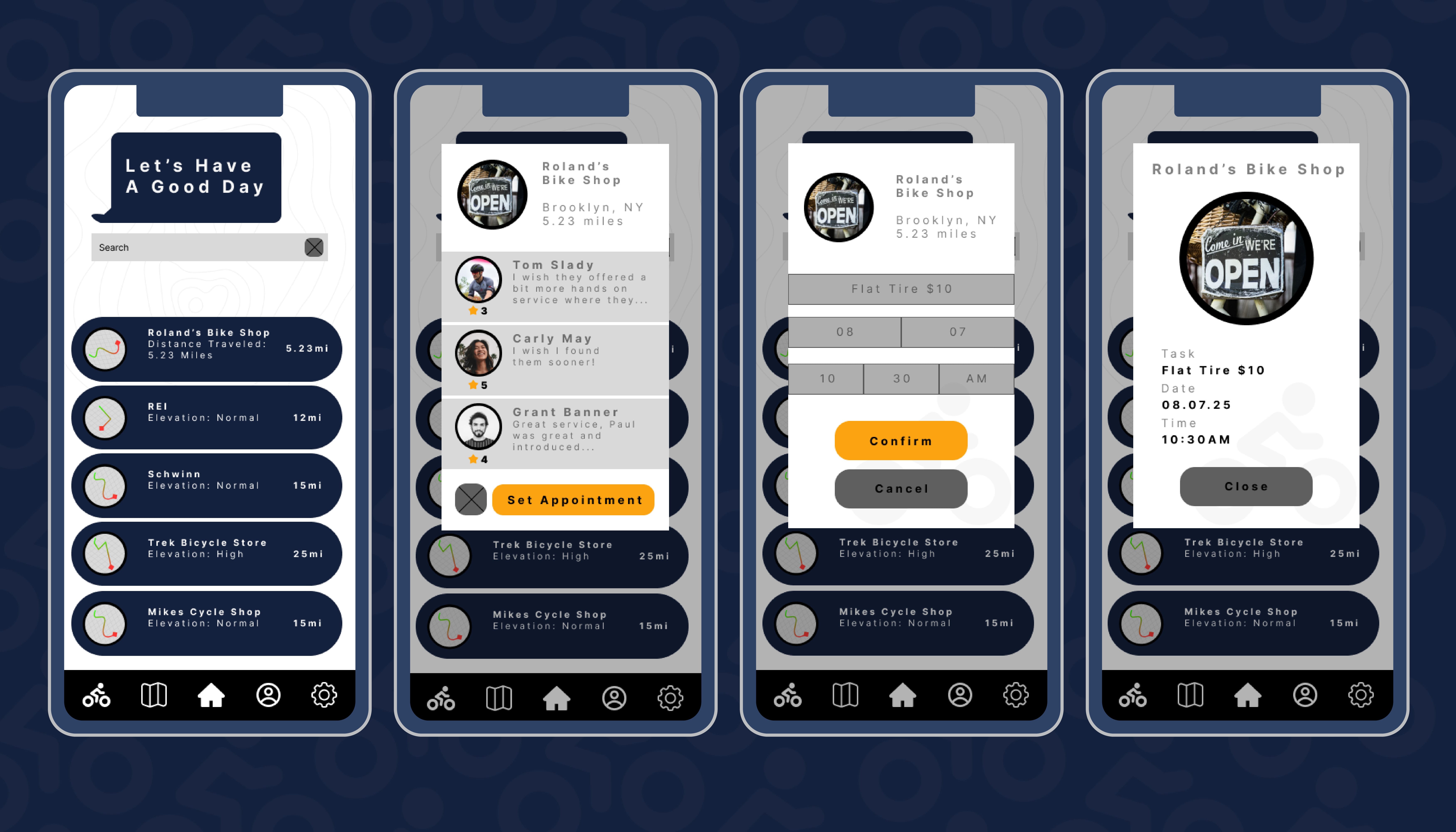
High-Fidelity Prototype

Accesibility Considerations
1.
Colors are vibrant and easily distinguishable from the background. This includes copy/text.2.
Page transitions to be fluid and easily digestable.
3.
Dark mode integration for users with sensory issues to light.Going Forward
Takeaways
Impact:Bringing a sense of community and knowledge to the cycling community.
What I learned:
Depending on how a user uses their bike, they need a different way to interact with the application.
Next Steps
1) Fill in gaps to create improvements to accessibility, like an introductory survery to cater a user experience.2) Create different color themes to add to accessibility.
3) Add a high contrast feature to allow for even more visibility.