
SentriKey Re-Design
Product Design
SentriKey (SKRE) is an subscription based app for agents, brokers, and admins in the real estate market to edit their listings, showings, and SentriLock lockboxes.
In this project my personal role was conducting interviews, laying out a project timeline, mocking prototypes, creating a working design system, and presenting to stakeholders.
Project Overview
The Product:
SentriKey Web
Project Duration:
1 Year
The Problem:
The company worked on a legacy system that was very outdated. This caused users to send feedback stating that the system did not feel uniform causing many pain points.
Goals:
-Improve overall structure within company practices to accomodate user needs.
-Introduce UX research including interviewing & analytics.
-Spearhead design QA efforts for developers, to create a streamline approach to have uniform designs.
-Create a working design system to be recycled within Figma.
The Numbers:
-User drop-off decreased by 35% on pages that adopted new navigation.
-25% decrease in calls to helpdesk.
-1 minute reduction in time from an average 4 minute user session once new navigation had become established.
(Before)
(After)
Discovery Phase
What did we find?
Starting the journey strong, I had set up a meeting with some of the key individuals that I needed on board to really adopt the overall UX aspect and how it could benefit the company. Listening to what our stakeholders, the company, and what our users wanted, a more in depth explanation of the goals stated above:
-Improve overall structure within company practices to accomodate user needs.
With this being our project managers first goal, the team took the initiative to spend time auditing and capturing the whole site as it currently stands.
-Introduce UX research including interviewing & analytics.
Luckily, the companies adoption of UX was very open arms and getting the tools for success were a breeze! Being the first generation of design in the company, we were able to introduce the company to a lot of resources that could create a uniform approach to collecting data from users and learning how to use it for company needs.
-Spearhead design QA efforts for developers, to create a streamline approach to have uniform designs.
This was something that we slowly started incorporating due to some trial and error. Working within an agile environment we found that to create a more uniform product, design QA needed to be introduced as a step in our process.
-Create a working design system to be recycled within Figma.
One of the larger bucket list items that we had brought up to management. Without the use of a design system the amount of revenue lost due to time consumption would be very costly.
Conducting Research
I started my research by interviewing current users about how they navigate the application, and what they would like to see in terms of improvements. This includes the key demographics that use our product, real estate agents, brokers, association admins, and our customer experience specialist.
-
The majority of potentials users are between ages 18-65.
-
Average time spent on the application in a 30 day span is about 4 minutes.
-
73% of current users use our application on a computer.
-
90% of users mentioned wanting for the quickest experience possible to complete specific goals.
Pain Points
1.
Realtors wanted a quick and easy approach to accessing the physical product via app while not slowing down real estate showings.
2.
Users had trouble navigating the web application due to a lack of primary navigation structure.3.
Users had to click through multiple windows to process certain information within addresses and lockboxes.4.
Application had two user interfaces causing confusion to end user.
Personas
With the nuance of the real estate industry, creating a wide range of personas was a key point to consider since users could range from 18-65. The fun thing about this sector is that it really applies to a broad spectrum of individuals. With the research made to find our demographic the personas below provide a sense of our user base.

Product Mapping Tool
A general workflow or path that our users need to go through to achieve a certain goal. This can include unlocking a lockbox, assigning a lockbox to an agent, assigning a lockbox to a listing, or even entering a listing.
Prototype & Visualization Phase
Process
With company goals and work flow in mind, most of the original iterations from paper wireframes, and low-fidelity prototypes were streamlined as it was much quicker for our team to create something efficiently with our design system, and edit them once the mockups were reviewed by the project team.
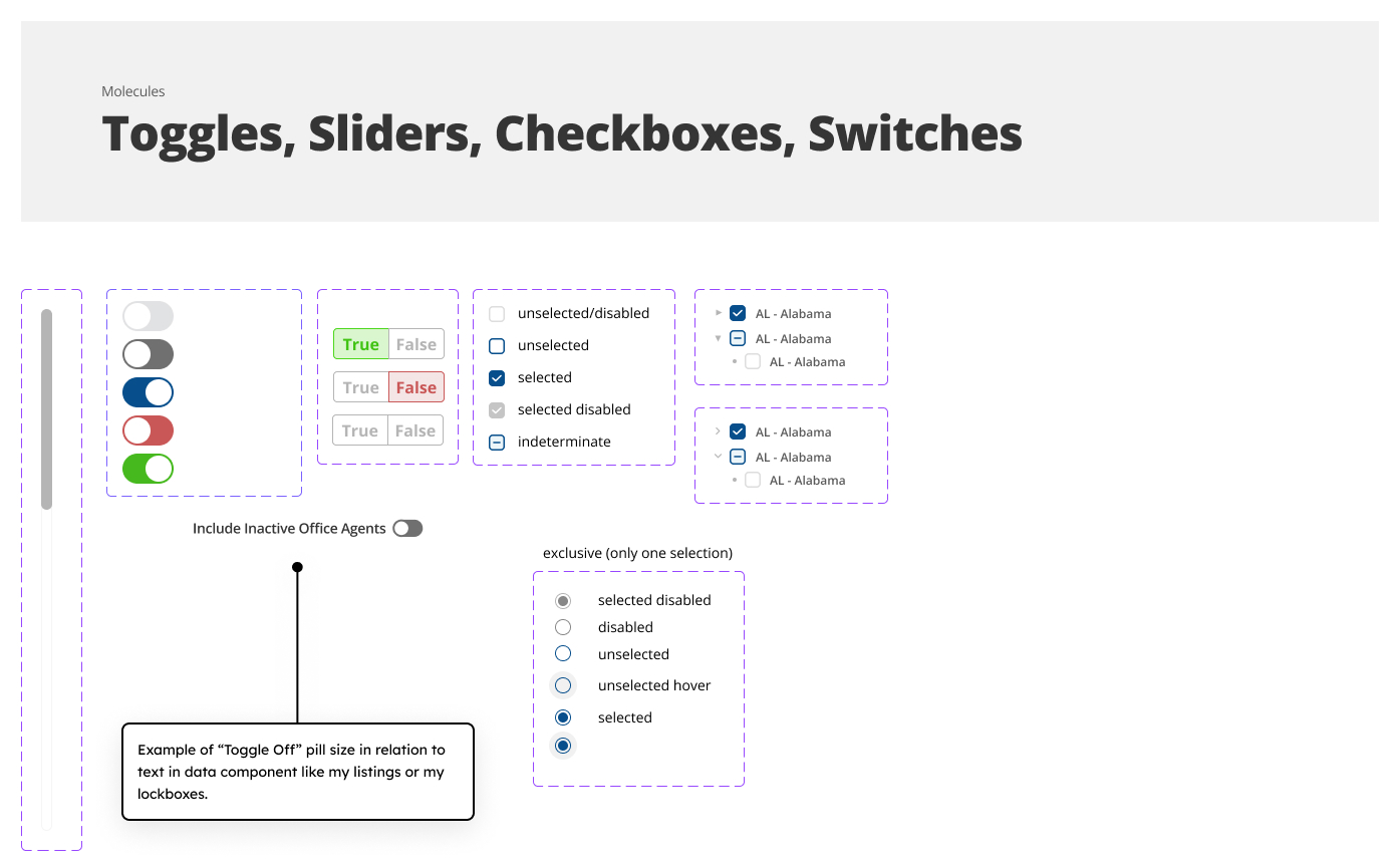
Design System
With the goal of refining the companies structure and consistency a bit more, we implemented a atomic design system in place to help bridge the gap between developers and designer workflows. This was a large endeavor that in the end translated to a more efficient way of designing in a more agile environment. With this in mind due to the scale I’ve provided a few snippets to paint the overarching picture.

Mockups

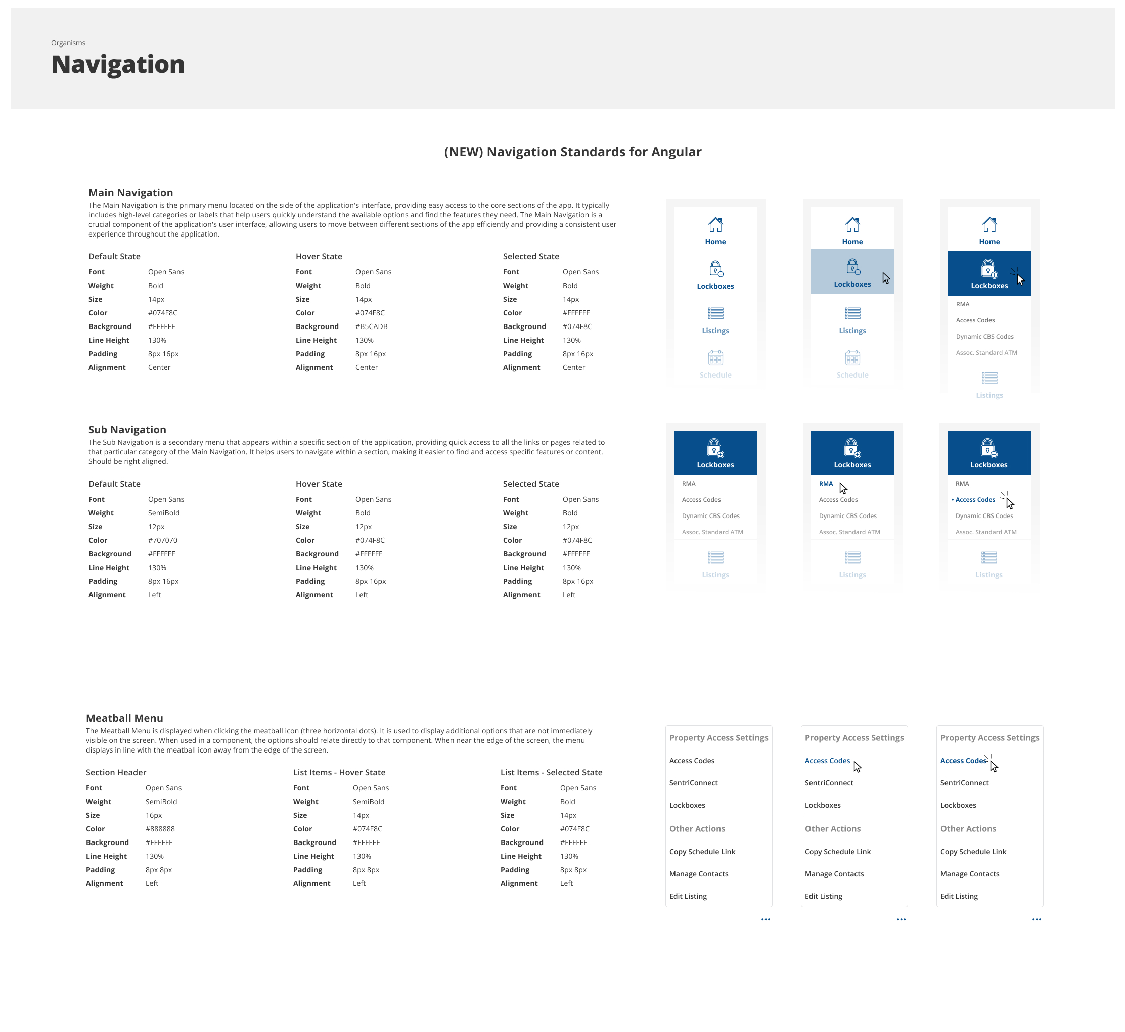
With the design system created, a large feature we wanted to revamp was over encompassing site navigation. As the company became larger and no user experience was accounted for, every feature the users requested was implemented without thinking of the repercussions long term. Below is a screenshot of what this navigation system looked like which included a top navigation that extends across the whole page, and a vertical navigation for “quick links”. With certain user permissions this is extended even further which caused it to pan off the page.
With this in mind we utilized this time to run research studies to see if a user could navigate efficiently to the resources they needed. This resulted in a accordian style vertical navigation that was approachable and categorized apropriately per user permission.


Testing Phase
During this phase, we released the new vertical navigation to our a/b testing groups and found that they had little to no issues navigating the vertical navigation. This was due to similarities in other real estate based found during our research, sites that realtors & agents used on a day to day basis. With the feedback we did receive below are some key takeaways and items we are working on currently improving!
Accesibility Considerations
1.
Resizing standards to be implemented in smaller platforms for tablets, and small mobile browsers.2.
Page animations are not fluid causing some pages to be confusing and inconsistent.
3.
Dark mode integration for users with sensory issues to light.Going Forward
Takeaways
Impact:
Creating the initial standardization
What I learned:
The goal of any real estate agent is to utilize our system as quick as possible. Small kinks can cause a loss of a home sale and cause very large pain points to occur.
Next Steps
1) Fill in gaps to create improvements to accessibility, like an introductory survery to cater a user experience.
2) Create different color themes to add to accessibility.
3) Add a high contrast feature to allow for even more visibility.